ShopDreamUp AI ArtDreamUp
Deviation Actions


Suggested Deviants


Suggested Collections


You Might Like…


Description
< next [link]
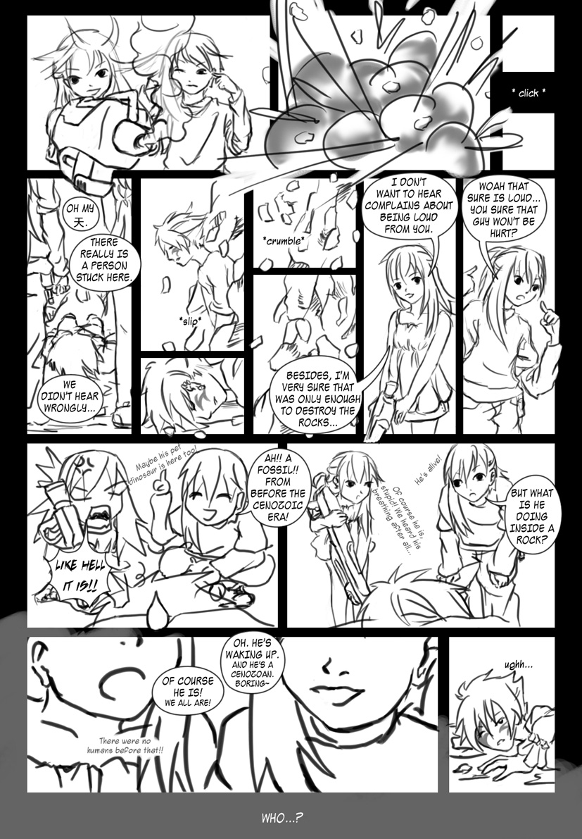
for =BlackLillian's competition.
RIGHT to LEFT
EDIT: thanks to ~odd-hunter for pointing out my wrong use of vocabulary.
the 2 kids, yoru (boy) and higure (girl) are © me
they are not japanese, but their mother named them so because she is an otaku. they are cyborgs, human bodies with mechanical insides. makes them quite heavy.
the man, deerg ([link]) is © ~crimson-road
he's a musician. that's all i know so far. i included her char because she didn't get through the coin toss
notes -
oh my 天 = omg
天 = god
Image size
827x1191px 326.31 KB
Comments5
Join the community to add your comment. Already a deviant? Log In
Hm... if I'm looking at this comic as an american comic, I'll say it's good in your own unique way.
If I'm viewing this as a japanese comic, it needs a lot of improvement. The funny part doesn't look fun at all, which doesn't actually attract readers since it's art presentation is not too good. (the panel from the 2nd bottom on the left or panel no. 12).
Not too bad or too good. Just average. Well, there's always room for improvement. Overall points I would give is 6.7/10.
It is a good idea if you add a minor background detail to further improve it because your background is fully blank. Well, it's just an advice. You don't have to listen/read if you want to. =x